COVID-19: Perception and Reality
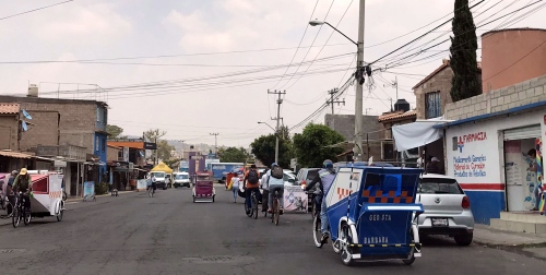
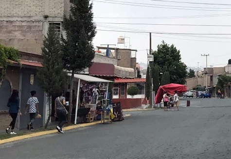
Walking down the street today, you might be forgiven if you thought for a moment that everything was “normal”. If anything, streets are busier. Shopping and business almost seemed to be going on as normal.


I was reminded again today of how differently things look depending on where you are – in which country, or even on which street. I’ve read articles from people in Mexico that seem difficult to believe – but then I’m reminded that even here, things are quite different depending on where you are. Even from one community to the next.
Just so you know, everything is not normal, although it’s difficult to give a general overview. It’s complicated. Many businesses are indeed closed. And right now many people are even more concerned about the dreaded “Phase 3”. Phase 3 is the threatened phase when things are supposed to get a lot stricter, and it’s likely to happen this week.
Oops – already out of date! A “Phase 3” was declared this morning. We are now learning about Phase 3 and what it will mean to all of us.
But just exactly what that will look like no one really knows – and again, it will vary from place to place (that’s not necessarily a bad thing, of course).
But people who, up until now, have been holding on to their jobs, or mostly regular hours, may find themselves in a much worse situation soon.
(There are actually more phases, but phases after 3 relate to recovery. So phase 3 is the worst phase, when the spread of the virus is considered to be the most dangerous.)
Today’s Chart
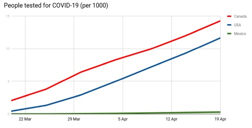
I thought you’d be interested in another chart – another chart that shows just how difficult it is to rely on simple “total cases” numbers that you may see (in Mexico now nearing 10,000). I was curious to compare testing rates – just how many people are actually being tested for COVID-19? Now, why would you test fewer people? Maybe because the cases are less severe. Or you have less money for testing. Or because people don’t bother to get tested. Many possible reasons! But testing rates obviously affect the totals we see.
So here it is, based on a chart from Our World in Data at Oxford University.

Canada is red – they’ve been doing an amazing amount of testing. The USA is blue. And Mexico is green. Can you see the green line?
So yes, that will make a difference in the stats.
Just for fun – “Stay home!” in the languages of Mexico…
Since this is a somewhat random post, here’s something fun from the government of Mexico. Would you like to hear what “Stay home!” sounds like in some of the many languages of Mexico? Scroll down this page to where it says “AUDIOS QUÉDATE EN CASA“, and you can click on over 50 different languages, urging you to stay home. 🙂
(Interesting, considering that dozens of languages in Mexico still have no Bible in their language! Something to think about…)

21 April 2020 @ 11:50 pm
Let us pray earnestly for the Mexican people who are apparently starting Phase 3, the worst phase, of the pandemic OVID 19. Mexico is very different than Canada or the U.S.A.They need God’s mercy and their leaders need His wisdom as they try to protect their citizens.
Thank you for clarifying the conditions there.